Accessible Web Products: A Comprehensive Guide to WCAG 2.1
Summary
This article provides a detailed overview of the Web Content Accessibility Guidelines (WCAG) 2.1 Level AA requirements, including successful implementations and common mistakes when trying to implement them. It also discusses techniques for adhering to these guidelines within the Flutter framework.
Key insights:
Making your Web product accessible makes it more user-friendly for everyone. The Web Content Accessibility Guidelines (WCAG) 2.1 Level AA is the technical standard required as of now.
Achieving Level AA compliance requires implementing all Level A and Level AA guidelines.
There are 4 principles these guidelines are centred around: your product should be Perceivable, Operable, Understandable and Robust.
Some of the ways of achieving these guidelines include providing text alternatives for non-text content, using sufficient contrast and allowing users to resize text.
All functionality should be available from a keyboard, users should get enough time to read and use content and there should be consistent navigation across your product.
The content should be readable, compatible and accessibility supported.
Flutter provides automated accessibility scanners to check the implementation of these guidelines easier, as well as screen readers and various accessibility widgets.
Introduction
The Web Content Accessibility Guidelines (WCAG) 2.1 provides comprehensive recommendations to enhance the accessibility of web content. Adhering to these guidelines ensures that web content is accessible to a diverse group of individuals with disabilities, including those who are blind or have low vision, are deaf or hard of hearing, have limited mobility, speech disabilities, or photosensitivity, as well as those with learning disabilities or cognitive limitations.
This article aims to provide a comprehensive overview of WCAG 2.1 requirements, detailing both successful implementation and common pitfalls. It also discusses strategies for applying these standards within the Flutter framework.
The WCAG 2.1
WCAG applies to websites, applications, and various other digital content across different devices. It was created by the Web Accessibility Initiative (WAI) of the World Wide Web Consortium (W3C) and serves as an international standard. WCAG defines three conformance levels:
1. Level A: The minimum requirement.
2. Level AA: Includes all Level A criteria plus additional requirements. This is the standard most organizations aim to meet.
3. Level AAA: The highest level, encompassing all criteria from Level A, AA, and AAA.
The Americans with Disabilities Act (ADA) Title II regulatory rule, published in the Federal Register in April 2024, establishes WCAG 2.1 Level AA as the technical standard for accessibility compliance.
While these guidelines significantly improve accessibility, they may not cover every specific need for all individuals with disabilities. By following these guidelines, web content becomes not only more accessible to people with disabilities but also generally more user-friendly for everyone. This includes but is not limited to people on smaller screens, people in areas with slow internet connections, and people who are not comfortable with technology.
WCAG 2.1, published in September 2023, enhances WCAG 2.0, which was established in 2008. While introducing new guidelines, WCAG 2.1 maintains full compatibility with the previous standards. This ensures that content that conforms to WCAG 2.1 automatically satisfies WCAG 2.0 requirements. Although WCAG 2.0 remains valid, the W3C recommends adopting WCAG 2.1 for more comprehensive accessibility efforts.
WCAG 2.1: Key Principles
WCAG 2.1 requirements are organized around four core principles, collectively known as POUR:
Perceivable: Users must be able to perceive the information and user interface components. This includes providing text alternatives for non-text content, offering content in different ways (e.g., a more straightforward layout) without losing meaning, and ensuring that content is easy to view and listen to.
Operable: User interface components and navigation must be operable. This involves making all functionality accessible via keyboard, giving users enough time to read and use the content, and assisting users in navigating and locating content.
Understandable: The information and the user interface's operation must be understandable. This means making text readable and comprehensible, ensuring that web pages function in predictable ways, and helping users avoid and correct mistakes.
Robust: Content must be strong enough to be reliably interpreted by a wide variety of user agents, including assistive technologies. This requires ensuring compatibility with both current and future user tools.
To achieve Level AA compliance with the WCAG 2.1 guidelines, it is essential to follow W3C’s recommendations for both Level A and Level AA. The following sections provide key requirements to meet each of the ‘POUR’ principles, ensuring that your web content is accessible and inclusive for all users.
1. Perceivable
1.1 Text Alternatives
Ensure that text alternatives are available for any non-text content. This enables the content to be transformed into other formats that people may require, such as large print, braille, speech, symbols, or simpler language.
1.1.1 Non-Text Content (Level A): All non-text content presented to the user has a text alternative that serves the same purpose, except in certain situations (check the complete list of situations here).
1.2 Time-based Media
Provide alternatives for time-based media.
1.2.1 Audio-only and Video-only (Prerecorded) (Level A): Alternatives must be provided for prerecorded audio-only and prerecorded video-only media, except when the audio or video is a media alternative for text and is clearly labeled as such.
1.2.2 Captions (Prerecorded) (Level A): Captions are included for all pre-recorded audio content in synchronized media, except when the media serves as an alternative for text and is clearly indicated as such.
Note that captions are different from subtitles. Subtitles provide the text of only the dialogue and do not include important sounds.
1.2.3 Audio Description or Media Alternative (Prerecorded) (Level A): An alternative for time-based media or audio description is provided for synchronized media unless it serves as a clear media alternative for text and is appropriately labeled.
1.2.4 Captions (Live) (Level AA): Captions need to be provided for all live audio content in synchronized media. These could be open captions (permanently embedded as text in the video track) or closed captions (only visible on the screen when the user requests it, which requires special support for captioning in the user agent).
Note that captions are different from subtitles. Subtitles provide the text of only the dialogue and do not include important sounds.
1.2.5 Audio Description (Prerecorded) (Level AA): All prerecorded video content in synchronized media should include audio descriptions.
1.3 Adaptable
Develop content that maintains its information and structure when presented in various formats, such as simplified layouts.
1.3.1 Info and Relationships (Level A): The information, structure, and relationships presented are either programmatically determinable or accessible through text.
1.3.2 Meaningful Sequence (Level A): When the order of content presentation impacts its meaning, a programmatically identifiable correct reading sequence is ensured.
1.3.3 Sensory Characteristics (Level A): Instructions for understanding and operating content are not dependent solely on sensory attributes like shape, color, size, visual placement, orientation, or sound.
1.3.4 Orientation (Level AA): Content allows for viewing and operation in multiple display orientations, avoiding restriction to a single orientation like portrait or landscape unless a specific orientation is essential.
1.3.5 Identify Input Purpose (Level AA): The function of each user input field for gathering information can be automatically identified under specific conditions: when the input field serves a recognized purpose outlined in the Input Purposes for User Interface Components section, and when implemented using technologies capable of identifying the intended meaning of form input data.
1.4 Distinguishable
Enhance user accessibility by improving the visibility and audibility of content, including distinguishing foreground elements from background.
1.4.1 Use of Color (Level A): Information, actions, responses, and visual elements are not solely conveyed through color.
1.4.2 Audio Control (Level A): If the audio on a web page plays automatically for more than 3 seconds, there must be a way to pause or stop the audio or adjust its volume independently from the system volume.
1.4.3 Contrast Minimum (Level AA): The visual presentation of text and images of text on a web page generally requires a contrast ratio of at least 4.5:1 to ensure readability and accessibility.
However, there are exceptions to this rule: large-scale text and images of large-scale text need a contrast ratio of at least 3:1, while text that serves as part of an inactive user interface component, is purely decorative, or is not visible to users does not have a contrast requirement. Additionally, text that forms part of a logo or brand name is exempt from contrast ratio requirements altogether.
1.4.4 Resize Text (Level AA): Text, excluding captions and images of text, must maintain its content and functionality when resized up to 200 percent without requiring assistive technology.
1.4.5 Images of Text (Level AA): If the technologies available support it, textual information should be conveyed through actual text rather than images of text unless customization by the user or specific presentation styles are essential for conveying the information accurately.
1.4.10 Reflow (Level AA): Content should ideally be presented in a way that preserves all its information and functionality without needing users to scroll in two directions. For vertically scrolling content, this means ensuring it remains usable at a width equal to 320 CSS pixels. Similarly, horizontally scrolling content should be functional at a height equivalent to 256 CSS pixels.
However, certain parts of the content that inherently require a two-dimensional layout for their usage or meaning may be exempt from these requirements.
1.4.11 Non-text Contrast (Level AA): Visual elements such as user interface components must have sufficient contrast with adjacent colors, ensuring a contrast ratio of at least 3:1.
This applies to elements necessary for identifying user interface components and their states, excluding those that are inactive or whose appearance is controlled solely by the user agent. Similarly, parts of graphical objects essential for understanding the content must also meet this contrast requirement unless a specific presentation of the graphics is integral to conveying the intended information.
1.4.12 Text Spacing (Level AA): In markup languages supporting text style properties, ensuring line height (line spacing) is at least 1.5 times the font size, spacing after paragraphs is at least 2 times the font size, letter spacing (tracking) is at least 0.12 times the font size, and word spacing is at least 0.16 times the font size should not result in loss of content or functionality when applied without altering other style properties.
Exceptions apply for languages or scripts that do not traditionally utilize some of these text style properties, where adherence to available properties suffices for conformity.
1.4.13 Content on Hover or Focus (Level AA): In scenarios where additional content appears and disappears upon receiving and removing pointer hover or keyboard focus, certain conditions must be met: The content should be dismissible without moving the pointer or focus unless it conveys an input error or does not obscure other content. If triggered by pointer hover, the content should remain visible when the pointer moves over it. The content should persist until the trigger is removed, dismissed by the user, or becomes invalid.
Exceptions apply when the user agent controls the visual presentation of the additional content without author modification.
2. Operable
2.1 Keyboard Accessible
All functionality should be accessible via a keyboard.
2.1.1 Keyboard (Level A): All content functionality can be operated using a keyboard interface without needing specific timing for each keystroke, except in cases where the function inherently depends on the user's movement path rather than just the endpoints.
2.1.2 No Keyboard Trap (Level A): If a keyboard interface can move focus to a component on the page, it must also allow focus to be moved away using only the keyboard. If more than the standard arrow, tab keys, or other typical exit methods are required, the user must be informed of how to move the focus away.
2.1.4 Character Key Shortcuts (Level A): If a keyboard shortcut in the content uses only letters (upper- or lower-case), punctuation, numbers, or symbols, then at least one of the following must be true: there must be a mechanism to turn the shortcut off, a way to remap the shortcut to include one or more non-printable keys (e.g., Ctrl, Alt), or the shortcut must only be active when its associated user interface component has focus.
2.2 Enough Time
Give users enough time to read and use content.
2.2.1 Timing Adjustable (Level A): For each time limit set by the content, at least one of the following conditions must be met: the user can turn off the time limit before encountering it, adjust the time limit to at least ten times its default length, or extend the time limit with a simple action for at least 20 seconds and do this at least ten times.
Exceptions include situations where the time limit is necessary for a real-time event, is essential and cannot be extended without invalidating the activity, or exceeds 20 hours.
2.2.2 Pause, Stop, Hide (Level A): For any moving, blinking, scrolling, or auto-updating information, the following must be true: for content that starts automatically, lasts more than five seconds, and is presented alongside other content, there must be a mechanism for the user to pause, stop, or hide it unless the movement is essential to the activity.
Similarly, for auto-updating information that starts automatically and is presented alongside other content, there must be a mechanism for the user to pause, stop, hide it, or control the update frequency unless the auto-updating is essential to the activity.
2.3 Seizures and Physical Reactions
Content is not designed in a way that is known to cause seizures or physical reactions.
2.3.1 Three Flashes or Below Threshold (Level A): Web pages do not include content that flashes more than three times per second unless the flash is below the general flash and red flash thresholds.
2.4 Navigable
Offer methods to assist users in navigating, locating content, and understanding their current position.
2.4.1 Bypass Blocks (Level A): A way is provided to bypass repetitive content blocks across multiple web pages.
2.4.2 Page Titled (Level A): Web pages have titles that accurately describe their topic or purpose.
2.4.3 Focus Order (Level A): When navigating a web page sequentially, focusable components receive focus in an order that maintains meaning and operability.
2.4.4 Link Purpose (In Context) (Level A): The purpose of each link is evident from the link text alone or together with its programmatically determined context unless the purpose would be ambiguous to users in general.
2.4.5 Multiple Ways (Level AA): There are multiple ways to locate a web page within a set of web pages, except when the page is part of a process or the result of one.
2.4.6 Headings and Labels (Level AA): Headings and labels clearly describe the topic or purpose.
2.4.7 Focus Visible (Level AA): Any keyboard-operable user interface has a mode where the keyboard focus indicator is visible.
2.5 Input Modalities
Enhance functionality accessibility through diverse input methods beyond just the keyboard.
2.5.1 Pointer Gestures (Level A): Ensure all functionality using multipoint or path-based gestures can operate with a single pointer, excluding when multipoint gestures are essential.
2.5.2 Pointer Cancellation (Level A): For functions operable with a single pointer, ensure completion occurs on the up-event, with options to abort or undo unless down-event completion is essential.
2.5.3 Label in Name (Level A): Components with labeled text or images must have names that reflect their visual presentation.
2.5.4 Motion Actuation (Level A): Functionality operable by device or user motion must include mechanisms to turn off accidental actuation, except when motion is essential or supported by accessibility interfaces.
3. Understandable
3.1 Readable
Text content should be readable and understandable.
3.1.1 Language of Page (Level A): Ensure the default human language of each Web page can be programmatically determined.
3.1.2 Language of Parts (Level AA): Ensure the human language of each passage or phrase in the content can be programmatically determined, except for proper names, technical terms, words of indeterminate language, and words or phrases integrated into the vernacular of the surrounding text.
3.2 Predictable
Ensure that web pages consistently appear and operate predictably.
3.2.1 On Focus (Level A): User interface components should not trigger a change of context when they receive focus.
3.2.2 On Input (Level A): Modifying settings of user interface components should not automatically change the context unless users are informed beforehand.
3.2.3 Consistent Navigation (Level AA): Navigational elements across multiple web pages should maintain a consistent order unless initiated by the user.
3.2.4 Consistent Identification (Level AA): Components with similar functionality across web pages should be consistently identified.
3.3 Input Assistance
Assist users in avoiding and correcting mistakes.
3.3.1 Error Identification (Level A): Automatically detected input errors are clearly identified, and descriptive error messages are provided to users.
3.3.2 Labels or Instructions (Level A): Appropriate labels or instructions accompany user input requirements.
3.3.3 Error Suggestion (Level AA): If an input error is automatically detected, suggestions for correction are provided to users unless it compromises security or the content's purpose.
3.3.4 Error Prevention (Legal, Financial, Data) (Level AA): Web pages involving legal commitments, financial transactions, or data submissions incorporate safeguards such as ensuring submissions can be reversed, validating and correcting user-entered data, and allowing users to review and confirm information before finalizing submissions.
4. Robust
4.1 Compatible
Maximize compatibility with current and future user agents, including assistive technologies, to ensure seamless functionality.
4.1.1 Parsing (Level A): In markup language content, ensure elements have complete tags, correct nesting, no duplicate attributes, and unique IDs as specified.
4.1.2 Name, Role, Value (Level A): Ensure all user interface components provide programmatically determinable names, roles, states, properties, and values for user agents and assistive technologies.
Successes and Failures
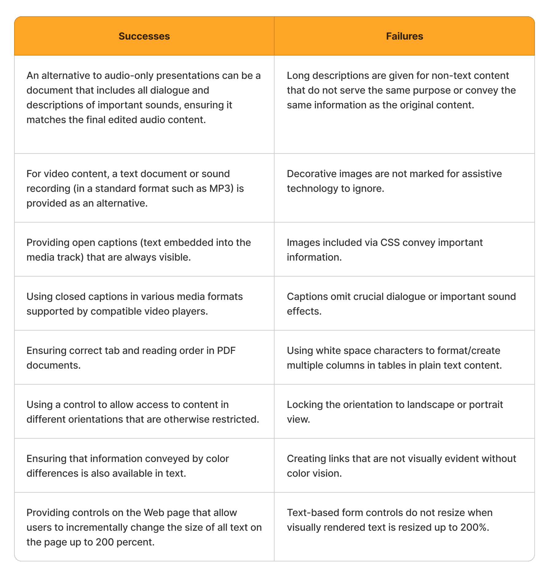
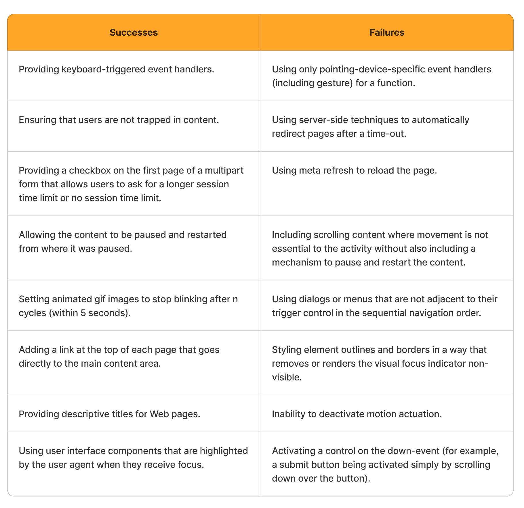
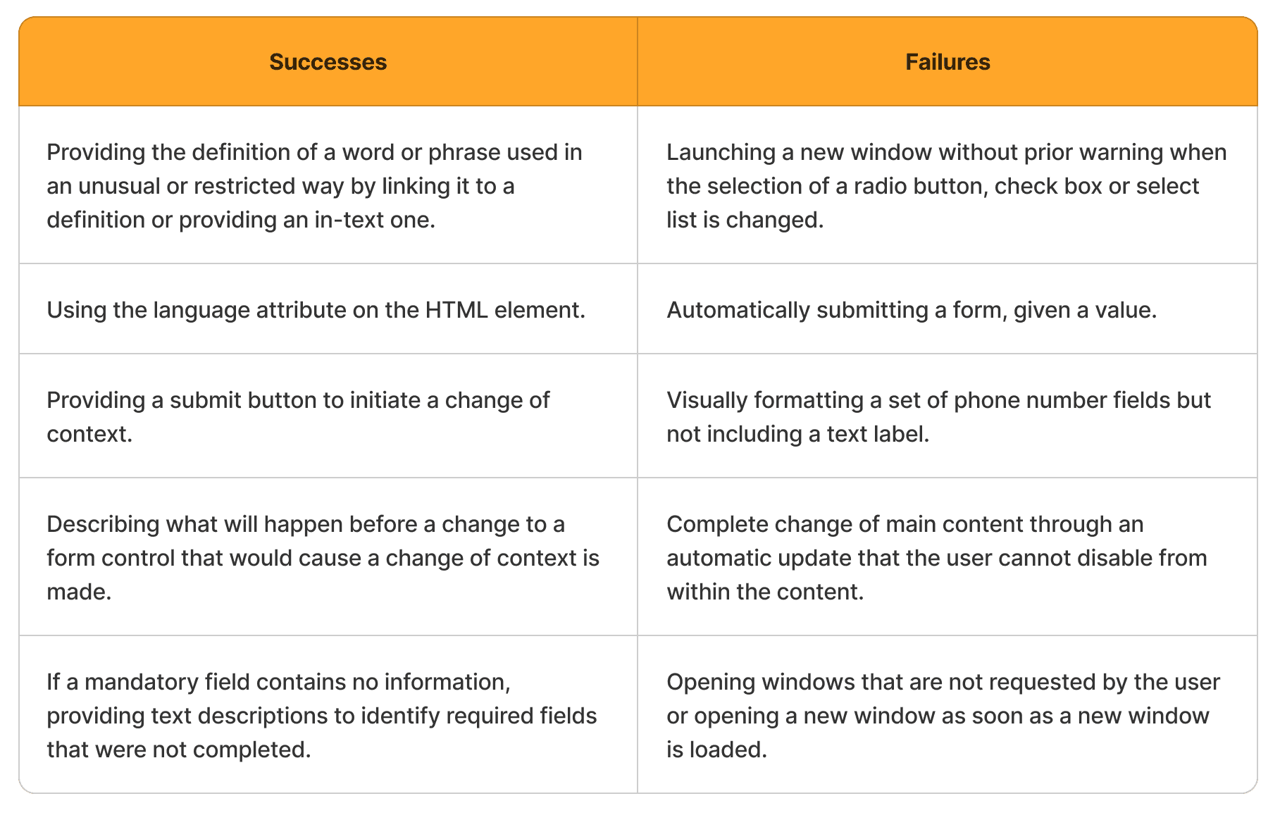
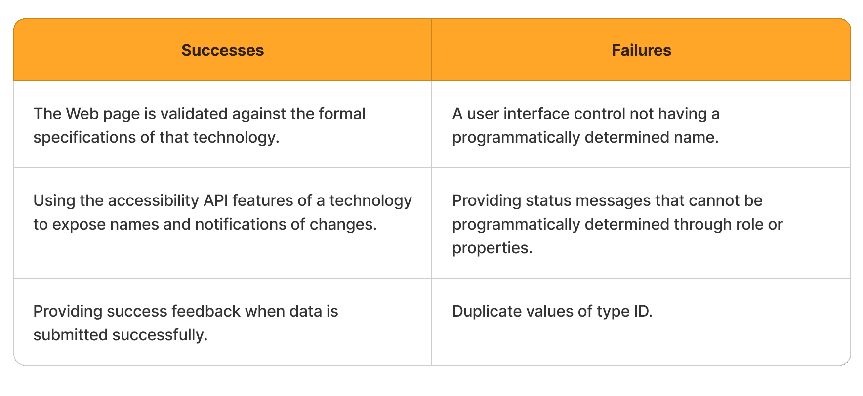
These are some examples of successful and unsuccessful implementations of each principle. To check out all acceptable implementations and perceived failures of a particular sub-guideline, go to the sufficient techniques and failures subsections within the WGAC 2.1 docs. Looking at the specifics of what you want to implement is highly recommended.
Perceivable:
Operable
Understandable
Robust
Implementation in Flutter
The W3C provides many advisory techniques to implement these guidelines in HTML and CSS. However, these are no longer the preferred development methods for apps. Here, we will discuss how these accessibility guidelines can be achieved in Flutter, a popular open-source app development framework developed by Google.
Flutter believes that ensuring apps are accessible to a broad range of users is essential to building a high-quality app. It especially emphasizes the importance of rendering text widgets with user-specified font sizes, screen readers communicating spoken feedback about UI contents, and rendering widgets with colors that have sufficient contrast.
Inspecting accessibility support can be done effectively using automated accessibility scanners tailored for different platforms:
1. Android:
Install and activate the Accessibility Scanner for Android.
Enable it in Android Settings under Accessibility > Accessibility Scanner > On.
Initiate a scan by tapping the Accessibility Scanner icon button.
2. iOS:
Open your Flutter app's iOS folder in Xcode.
Choose a Simulator as the target and run the app.
In Xcode, navigate to Xcode > Open Developer Tools > Accessibility Inspector.
Enable "Point to Inspect" under Inspection, then select UI elements to check their accessibility attributes.
Use the Audit feature to run a comprehensive check for potential issues.
3. Web:
Open Chrome DevTools or similar tools in other browsers.
Inspect the HTML tree containing ARIA attributes generated by Flutter.
In Chrome, navigate to the "Elements" tab and access the "Accessibility" sub-tab to inspect the exported semantics tree data.
Here is a non-exhaustive checklist to consider before releasing your app:
Ensure all interactive elements perform actions when interacted with. For instance, buttons with no-op callbacks for
onPressedevents should display aSnackBarto indicate their function.Test screen reader compatibility to ensure all controls are intelligibly described when tapped, using TalkBack for Android and VoiceOver for iOS.
Aim for a contrast ratio of at least 4.5:1 between controls/text and backgrounds, excluding disabled components. Verify images for adequate contrast. For large text, the W3C recommends a contrast ratio of 3.0:1.
Avoid automatic context changes while users input information; require confirmation for context switches triggered by widgets.
Ensure tappable targets are at least 48x48 pixels in size for ease of use.
Implement mechanisms to undo important actions and provide error fields with suggested corrections where feasible.
Test controls for usability in colorblind and grayscale modes to accommodate users with color vision deficiencies.
Maintain UI legibility and usability at high text and display scaling factors.
For detailed implementation recommendations and examples, check out the Flutter accessibility documentation and this deep-dive into Flutter’s accessibility widgets.
Get WCAG Compliant with Walturn
At Walturn, we integrate WCAG Level AA compliance into our product engineering services to ensure your digital solutions meet essential data protection standards. By partnering with us, you can confidently address WCAG requirements while focusing on your core business objectives. Reach out to us to enhance your products with built-in compliance and data security.
Conclusion
With the boom in Web services, upholding accessibility standards is essential to maximise the number of users able to use your product. While the W3C does not provide any checks/certifications to websites, implementing the WCAG 2.1 Level AA is the technical standard as of April 2024. This involves implementing their in-depth guidelines to ensure that your product is Perceivable, Operable, Understandable, and Robust. You can always aim to go above and beyond by implementing some Level AAA guidelines. This article aims to provide a start by providing all the information in one place. The official WCAG 2.1 reference and Flutter docs are good places to consult for more details.
Authors
Achieve WCAG 2.1 Compliance with Walturn
Ensure your digital solutions are accessible to all with Walturn's comprehensive WCAG 2.1 Level AA compliance services. Our team specializes in integrating accessibility standards into your products, making them more inclusive and user-friendly. By partnering with Walturn, you can enhance user experience, meet regulatory requirements, and expand your audience reach. Let us help you build accessible digital solutions that stand out.
References
“Accessibility.” Flutter, docs.flutter.dev/ui/accessibility-and-internationalization/accessibility.
Flutter - Build Apps for Any Screen. flutter.dev.
Guler, Muhammed Salih. “A Deep Dive Into Flutter’s Accessibility Widgets - Flutter Community - Medium.” Medium, 7 Dec. 2021, medium.com/flutter-community/a-deep-dive-into-flutters-accessibility-widgets-eb0ef9455bc.
How to Meet WCAG (Quickref Reference). www.w3.org/WAI/WCAG22/quickref/?versions=2.1#principle1.
Initiative, W3c Web Accessibility. “Introduction to Web Accessibility.” Web Accessibility Initiative (WAI), www.w3.org/WAI/fundamentals/accessibility-intro.
Initiative, W3c Web Accessibility. “Web Content Accessibility Guidelines (WCAG) 2 Level AA Conformance.” Web Accessibility Initiative (WAI), www.w3.org/WAI/WCAG2AA-Conformance.
WCAG 2.1 Level AA | NC DPI. www.dpi.nc.gov/about-dpi/technology-services/digital-accessibility/wcag-21-level-aa#Understandable-5778.
Web Content Accessibility Guidelines (WCAG) 2.1. 21 Sept. 2023, www.w3.org/TR/WCAG21/#intro.


