Unlocking Focus: How Color Palettes Can Help Neurodivergent Students Thrive

Summary
Understanding the impact of colors on neurodivergent students is crucial for enhancing their learning environment. These insights guide educators and product designers in creating supportive spaces that promote effective learning and well-being for neurodivergent students, taking into account factors like age and specific conditions.
Key insights:
Calming Colors: Blues and greens help create a relaxing environment conducive to learning.
Stimulating Colors: Bright and fluorescent colors can lead to sensory overload and should be used cautiously.
Age-Related Preferences: Color preferences and their effects can change as neurodivergent children grow, suggesting the need for adaptable learning environments.
Impactful Design Choices: Proper use of color can significantly enhance focus and emotional stability in neurodivergent students, aiding their educational development.
Image by drazenphoto on Envato Elements
Introduction
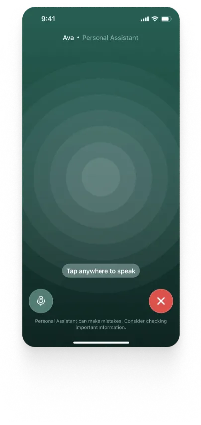
When diving into the spectrum of neurodiverse students, it is extremely important to know that they have a different impression of colors. These colors that may look usual to us are something that they can really dive into, and just like we have a certain effect of colors in our environment, they have it too, however many times more.
Neurodivergent students often react differently to colors compared to their neurotypical counterparts. According to an article posted on medium, 85% of neurodiverse students see colors more intensely. This means that the colors of all sorts have quite an impact on the well being and behavior of a neurodiverse student. Bright colors can be overwhelming and can lead to sensory overload. That is why whenever a product is being developed specifically to cater the needs of these students, the color palette applied has an integral value.
Researchers have worked on this aspect of the lives of neurodivergent people and the results have indicated that there is indeed an impact of each color on the behaviors of neurodivergent people. A similar research titled “A case study on the effect of light and colors in the built environment on autistic children’s behavior” was conducted in November 2022 which included students from autistic schools in India and their parents/caretakers. This research was conducted with the objective to identify the impact of light and color on autistic children.
The average age of children included in this study was 8.7 years and the results of the research concluded that different color hues have varying impacts on autistic children. Neutral tones and mellow colors have a calming and soothing effect and are considered autistic-friendly. On the other hand, bright, bold and intense colors have a refreshing and stimulating impact on the child.

Colors With Positive Impacts
For neurodivergent children, navigating the world can be a symphony of sensory signals. Among these, color plays a surprisingly powerful role, influencing mood, focus, and even behavior. A bright red might set off an emotional firestorm, while a calming blue can become a safe harbor. Understanding this unique relationship between color and behavior opens doors to creating supportive environments that nurture the potential of these extraordinary minds.
Some of the colors that have a positive impact on neurodiverse students specifically for the learning aspect are as follows:
Blue & Green
As per the researchers, the colors blue and green mainly make the cooler side of the color tables and are known to have a withdrawal effect by generating a feeling of avoidance. Moreover, blue and green being cooler colors generally get noticed later which also gives a feeling of comfort and relaxation. The colors blue and green represent earth as they are the most common naturally occurring colors. These colors have a positive impact on any person, but for someone who intensely feels colors would feel a soothing and calm effect.
Pink and Lilacs
Pink and lilacs, similar to blue and green, have generally positive impacts. As per a study in 2011 by Vanessa Lobue and Judy S Deloache, at a certain age, pink color is avoided by boys due to social norms but on the other hand, pink is said to be the favorite color of many neurodiverse students of young ages and that lighter tones of pink enhance the concentration of these children. Similarly, Lilac is as soft as pink and it also enhances the feeling of safety and love.
Orange
The impact of orange as a color is the most interesting as it enhances the appetite feeling of neurodiverse students. Although this color is not commonly used in learning products, yet it can be utilized to have a positive impact in some use cases. International Journal of Progressive Education, Volume 18 Number 5, 2022 suggest that orange color along with yellow and purple is preferred by introverted students with learning disabilities whereas the ones that are more energetic tend to choose colors like blue and green due to their calming effect.
Yellow
Yellow is one of the most important colors that is used in learning products generally for students as it fosters creativity and the feeling of learning. Since this impact is in folds for neurodiverse students, yellow color can really bring quite an impact for these children. International Journal of Progressive Education suggests that warm colors such as yellow can enhance creativity and energy. It can also have negative effects on some students such as violence, aggression and concentration difficulties.
Brown and Beige
One of the most challenging things neurodiverse children go through is to balance out the emotions that they are facing. Brown and beige colors play the role of balancing out these emotions and intensities and allow these children to learn and interact with products. These neutral tones create a calming environment, fostering a sense of stability that is particularly beneficial for neurodiverse individuals. Additionally, the incorporation of such colors in educational materials and surroundings promotes a soothing atmosphere, positively influencing their overall well-being and learning experiences.
Colors with Negative Impacts
Colors that can have a negative impact on neurodivergent students exist and it is integral to know exactly what these colors are capable of. The use of these colors should be carefully considered as some of these impacts may sound negative but could be utilized for creating emotions of positive nature as well. Some of these colors are as follows:
Red
The color red can really amplify the feelings of different sorts including both anger and energy, and can cause a neurodiverse child to throw tantrums. An article written on Experia by Gareth Jones on April 26th, 2021 stated that colors in the red range are considered high-energy colors. They can have multiple effects on neurodivergent children including tension and hyper action along with triggering meltdowns. For learning products, this color should be carefully used as it can take the focus of a child away from learning, however a proportionate use of the color red can still have some positive impact.
Fluorescent/neon colors
Fluorescent and neon colors have high attention grabbing properties which is often used in over the top marketing strategies. However, when it comes to the neurodivergent people, this color can have an extremely negative impact. Fluorescent lighting and colors have a flickering effect that can cause anxiety and headaches for neurodivergent people. Verywellhealth.com describes the effect of these lights and colors as a sensory overload for neurodivergent people. Such an overload causes anxiety, fear, anger making them unapproachable.
Do the color impacts change with age?
There is no definitive answer to this but researches do suggest that age is a factor that changes color palette impacts. International Journal of Progressive Education, Volume 18 Number 5, 2022 mentions a study where students of different grades in a school for autistic students were given an exercise to fill in colors of their choices in different shapes. The conclusion was quite interesting as the results of one grade were quite different from the other.
At a preschool level, for square shapes, green and red colors were used the most whereas in the primary school level, students refrained from using red and mostly used green. At the secondary school level, green was the favored choice as well but when the same test was conducted on high school students, dark colors like claret red, gray, dark blue, dark green, dark turquoise, and violet.
The color selection for circle shapes was quite different from square shapes but the general color tones were similar. This shows that at the early ages, neurodivergent students were choosing brighter colors whereas in later ages, they became more confident in using darker colors.
Conclusion
Navigating the diverse landscape of neurodivergent needs requires product designers to wield their color palettes with precision. From optimizing focus with biophilic greens to mitigating sensory overload with carefully calibrated contrast ratios, data-driven design choices become essential in crafting inclusive learning environments. Every hue becomes a variable in an equation aimed at unlocking the full potential of each student's unique neural symphony. Factors that need to be considered while defining the color palette are as follows:
1. Age of students
2. Specific conditions of students
3. Shapes being used
4. Type of content
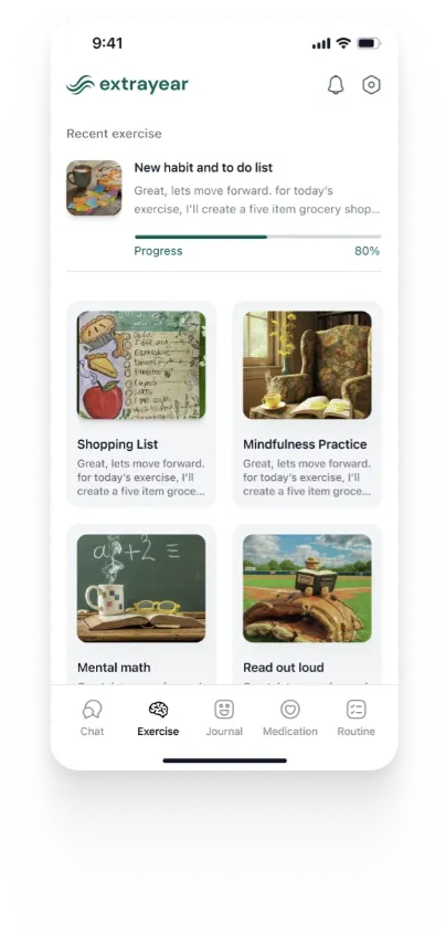
It is believed that a color palette with blends of blue, green, pink and lilacs and a touch of the warm colors like orange and red can increase engagement along with keeping the neurodivergent students both calm and relaxed. Such a color palette in a product can do wonders, and on the other hand, if not enough thought has been put into this, the positive effects of the product can be overshadowed by the negative impact of colors.
References
https://www.ghp-news.com/best-colours-to-support-your-childs-well-being/
https://medium.com/@akashsinha_70703/the-effect-of-colors-in-autistic-chil
dren-color-preferences-in-children-with-autism-dd85eab3f20
https://www.experia.co.uk/blog/ultimate-guide-to-autism-friendly-colours/
https://files.eric.ed.gov/fulltext/EJ1363978.pdf
https://www.ncbi.nlm.nih.gov/pmc/articles/PMC5179595/
https://www.verywellhealth.com/autism-and-sensory-overload-259892
https://pheels.com.au/blogs/blog/top-7-sensory-friendly-colours-for-neuodiverse-children
https://pubmed.ncbi.nlm.nih.gov/21848751/
https://www.frontiersin.org/articles/10.3389/fpsyt.2022.1042641/full
http://jea-net.com/journals/jea/Vol_10_No_2_December_2022/3.pdf


